Ligature Logo Project
- Nov 21, 2016
- 1 min read


Ligature Logo Project:
Date: 11/21/16
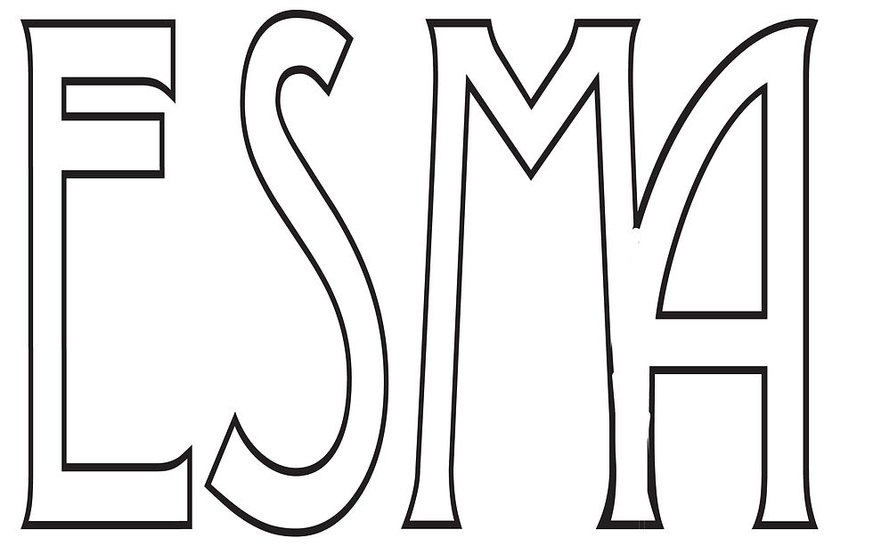
What is a ligature logo?
A ligature logo is when letters are tied to make a compact signature that is perfect for companies that are known mainly by their initials.
How would describe the corporate identity of ESMA in 5 words?
I would describe ESMA in five words as modern, trendy, colorful, cool, and music.
Which logo out of the two do you feel is the strongest and why?
I feel that my strongest logo is the blue and black one. The letter M and the letter A are attached at the end, and I used a combination of colors that look good together.
If you had no requirements or restrictions how would your logo look different?
To make my logo look different I would add a picture if I had no requirements or restrictions.
Explain which ligature techniques you have demonstrated on each logo:
I demonstrated the technique of angle to vertical in my logos.


Comments